
Accessibility and form usability at Clavendro Digital
Forms fail people quietly. A field with no label, an error message shown only in color, a submit button you cannot reach without a mouse. This register shows how the Clavendro Digital contact and inquiry forms are built for keyboards, screen readers, and small screens.
4821 Westheimer Rd, Houston, TX 77027
What this page covers
- 01 Real labels on every field
- 02 Keyboard path from first field to submit
- 03 Inline validation that gets announced
- 04 Confirmation text and where focus lands
- 05 Narrow-screen layout and tap targets
- 06 How to report a problem

Every field has a real label
Labels sit above their inputs and are tied to them in the markup. A screen reader announces "Email address, edit text" instead of reading out an unlabeled box, and the label stays visible after you start typing. Placeholder-only labels are avoided here, because the field description disappears the moment you type a character, leaving screen reader and low-vision visitors with no idea what the field was for.
Keyboard accessible from top to bottom
You can complete and submit the whole inquiry form without touching a mouse. Tab moves through fields in the same order they appear on screen, the submit button is reachable by keyboard, and focus stays visible as it moves. No interaction on this site depends on a hover state a keyboard user cannot trigger, and nothing traps focus in a loop. Tab past the last field and you land on the submit button, then the footer links — the order most people expect.
If you are evaluating a form somewhere else, the practical test takes about a minute: load the page, press Tab once, and follow the focus outline. If you lose sight of it, or it jumps somewhere that makes no sense, the form needs work before you trust it with a real inquiry.
What happens when validation fires
Inline validation messages appear next to the field they belong to and are tied to that field in the markup, so a screen reader announces the problem when focus reaches the input instead of leaving it as a visual cue only. Error text explains what to change in plain words — telling you the address needs an @ sign is more useful than turning the border red. Messages stay until the issue is fixed, then clear.
This is the pattern we use
Email address *
name@domain
Add the part after the @ sign — for example, [email protected].
What we avoid
Email address
name@domain
A red border with no sentence leaves the visitor guessing what changed and why.
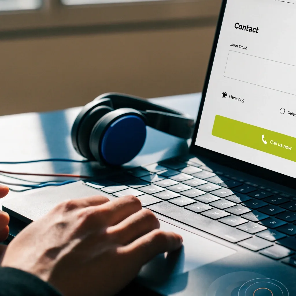
The confirmation message and focus
After a successful submission, the confirmation message replaces the form area and takes focus, so a screen reader user is told the submission worked instead of being left on a page where the form silently vanished. The message is written as text, not as an image, and it repeats the phone number so you can read it or dial it from the same screen.
Step one
You submit
The form posts, the page does not reload into a blank state, and the fields stop accepting input.
Step two
Confirmation replaces the form
A short written message confirms the inquiry arrived. No image, no icon-only success mark, nothing for a screen reader to skip.
Step three
Focus moves to the message
Keyboard and screen reader users land on the confirmation instead of hunting for it further down the page.
Mobile-friendly layout, not just a shrunken desktop
The form collapses to a single column on narrow screens, inputs use a readable base size so phone browsers do not zoom unexpectedly when you focus a field, and the submit button and links meet a practical tap size. There is no horizontal scrolling to reach a field, and required markers and validation text stay visible at small sizes instead of being clipped off the edge.
- 01 One column at narrow widths, no side-by-side squeeze
- 02 Input text at a size that stops accidental zoom on focus
- 03 Submit button and links sized for a thumb
- 04 Required markers and error text never clipped
Screen reader behavior in practice
Page heading and intro
Reading starts with the page title and the opening paragraph, so you know where you are before the form appears.
Labels and controls in sequence
Each label is announced with its control, in the same order they appear on screen.
CTA links come last
Links to contact, handling, and privacy follow the form, so they do not interrupt the field list.
Decorative parts hidden
Rules, dividers, and background detail are hidden from assistive technology so they do not break the reading order.
If a screen reader user hits an issue that these conventions do not catch, the phone number on the page is a working fallback. Saying so plainly is part of the design, not an admission of failure — there is no version of a web form that covers every assistive technology combination in use, and the phone line is staffed on working days.
What accessibility does not mean here
It does not mean the visual design is stripped back or the page is reduced to plain text. It means labels are real, errors are announced, focus is visible, and the form works without a mouse. Those four things cover most of what breaks contact forms for people using assistive technology, and they are treated as requirements rather than extras bolted on later.
In practice that shows up as the same clean white page everyone else sees. The labels, the orange required marks, the inline error sentences, and the confirmation text are the accessibility work — none of it needs a separate mode, a stripped theme, or a toggle.
Reporting an accessibility problem
If something on this site blocks you from submitting an inquiry, call the number below and describe the problem. Reports about a specific field, a screen reader announcement, or a mobile layout issue are the most useful. The reply will say what changed or explain why the current approach was chosen. Accessibility feedback is read by the same team that reads inquiries.
Call or visit us in Houston
The phone number is displayed on every page of this site, including this one. If a form issue blocks you, calling is the shortest route to a person who can either take the details or pass them along.
What you can count on when you use the form
Questions about the form
Three short answers about keyboards, screen readers, and the phone alternative. If yours is not here, the full FAQ goes into more detail.
Frequently Asked Questions01 Can I use the form with only a keyboard?
Yes. Tab order follows the visual layout, focus stays visible as it moves, and submission is a keyboard action. Nothing on the inquiry form depends on hovering with a mouse.
02 Do error messages work with screen readers?
Validation text is associated with its field, so it is announced when focus reaches that input, not only shown as a red border. The message explains what to change and clears once the field is correct.
03 Is there a phone alternative if the form does not work for me?
Yes. The phone number, +1 713-524-8037, is displayed on every page, and calls are read by the same team that reads inquiries. You can also describe the problem by phone if the form itself is what is blocking you.
Send an inquiry, or call if the form is the problem
Both routes reach the same team. Use the form for a structured request with the details already laid out, or call if you would rather talk it through — including when the form itself is what is blocking you.